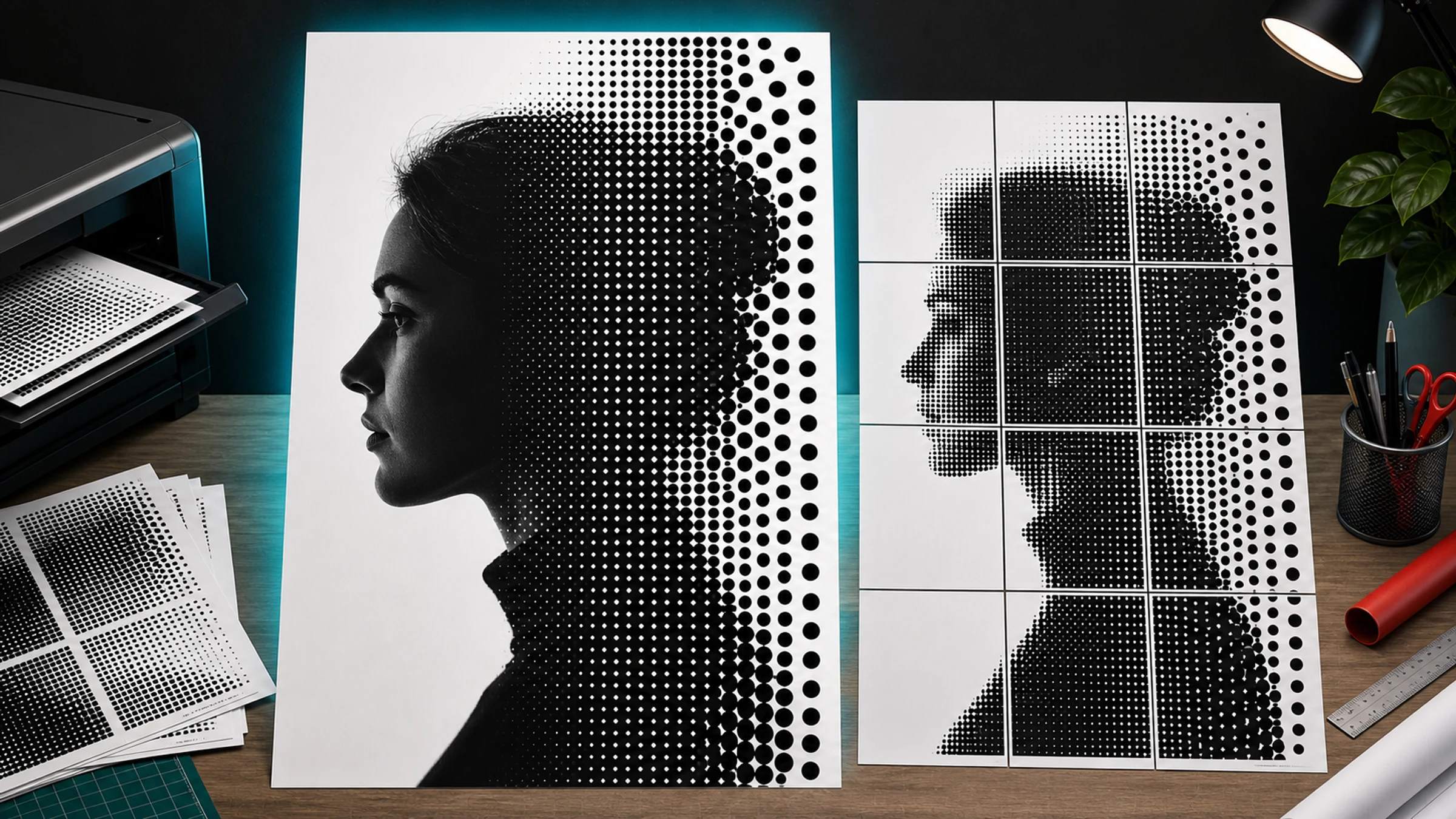
Rasterbator is the informal name many people use for a poster effect that turns an image into a grid of large printable dots. From close up, you see circles. From across the room, those dots blend into a recognizable portrait, logo, object, or scene.
The style is simple, graphic, and forgiving. A small image becomes oversized wall art by converting tones into dots and splitting the result across normal printer pages.
One practical print detail matters from the beginning: most home printers leave a 3-5 mm unprintable white border around each page. That is normal. For a clean tiled poster, plan to trim those borders, use overlap where available, or accept small gaps as part of the handmade look.
Rasterbator.pics prepares the halftone poster locally in your browser, so your image is processed on your device while you choose the dot style, poster size, paper layout, and tiled PDF export.
What does Rasterbator mean?
Rasterbator is an informal term for turning a raster image into a large-format poster by creating a halftone dot pattern and splitting the result across printable pages.
The name is informal, but the visual method is classic. It borrows from halftone printing, the same broad idea used in newspapers, comics, screen printing, and old printed photographs.
In practice, the workflow is:
Select a photo or graphic.
Convert it into a dot-based halftone image.
Split the poster across multiple printer pages.
Print the pages at home or on an office printer.
Trim and assemble the pages into one large poster.
How black-and-white halftone dots work
A black-and-white halftone poster does not print smooth gray ink. It simulates brightness with dot size.
| Original image tone | Halftone result | What you see from far away |
|---|---|---|
| White highlight | No dot or a tiny dot | White or very light gray |
| Light gray | Small dot | Pale tone |
| Medium gray | Medium dot | Midtone |
| Dark gray | Large dot | Dark tone |
| Black shadow | Very large dot | Nearly black area |
Dark parts of the image become larger black dots. Light parts become smaller dots or empty paper. From a distance, your eye blends the dots into recognizable tones.
The viewing distance is part of the design. A poster that looks chunky from 30 cm can look clear from 3 meters away.
Understanding dot size
Picture the poster as a grid of cells. Each cell contains one dot. The brightness of the source image inside that cell determines how large the dot becomes.
| Dot style | Best for | Trade-off |
|---|---|---|
| Small dots | More detail, faces, smaller posters | Can look too smooth from far away |
| Medium dots | Balanced wall posters | Good starting point for most images |
| Large dots | Bold graphic style, big posters | Fine details may disappear |
If the result looks like a normal grayscale print, the dots are probably too small. If eyes, facial features, or important edges disappear, reduce the dot size or make the poster larger.
Which photos work best?
A halftone poster is only as strong as the source image. The best images are simple, high-contrast, and readable from far away.
Good choices include:
portraits with clear lighting
faces with strong shadows and highlights
animals with recognizable silhouettes
architecture with bold shapes
cars, bikes, instruments, and objects with clear outlines
logos or icons, if you have the right to print them
black-and-white photos with dramatic contrast
Images that usually work poorly include:
very dark photos with no detail
washed-out images with weak contrast
busy group photos
tiny faces inside a large scene
screenshots with small text
low-resolution images with heavy compression
photos where the subject blends into the background
Quick test: shrink your image on screen until it is thumbnail-sized. If you can still understand the subject, it will usually work better as a halftone poster.
What to look for in portraits
Portraits are the classic Rasterbator-style subject. Choose a photo where:
the face is large in the frame
the eyes, nose, mouth, and hairline are clear
there is a visible difference between light and shadow
the background is not too distracting
the image is not blurred
Side lighting usually works better than flat front lighting because it creates stronger shadows and highlights.
Choosing poster size
Poster size affects both visual impact and assembly effort.
A larger poster:
looks more dramatic on the wall
works better with big dots
requires more pages of paper
takes longer to trim and assemble
needs more wall space
A smaller poster:
is easier to print and mount
uses fewer pages
may need smaller dots to preserve detail
is less dramatic from across the room
Set your poster size by choosing final dimensions, such as 60 cm x 90 cm, or by defining how many pages wide and tall you want the poster to be. For a first project, a poster 3-4 pages wide is usually manageable.
Black-and-white or color?
Classic Rasterbator-style posters are often black-and-white because the dots are clear, high contrast, and easy to print on a standard printer.
Choose black-and-white when you want:
strong contrast
lower ink complexity
a newspaper or punk-poster look
easier page matching
a clean DIY wall-art style
Color halftone can work, but it is less forgiving. Color printers may shift tones between pages, and ink coverage can become heavy. For your first halftone poster, start with black-and-white.
How to make a Rasterbator-style poster
Here is a practical workflow:
Open Rasterbator.pics.
Select a clear, high-contrast photo.
Choose a black-and-white halftone or dot style.
Set the poster size by final dimensions or by page count.
Adjust dot size until the subject is readable from a distance.
Preview the poster and check the page count.
Export the tiled PDF.
Open the PDF and confirm it shows the expected number of pages.
Print at Actual Size or 100%.
Trim unprintable margins where needed.
Assemble the pages with a glue stick or tape on the back side.
A tiled PDF contains all poster pages in one file. You do not need to upload the image anywhere or create an account to prepare the poster in Rasterbator.pics.
PDF, ZIP, and tiled printing
A tiled PDF is the easiest format for home printing. It contains the poster split across multiple pages, ready to print.
A ZIP export can be useful when you want individual page images or more manual control, but for most beginners, a PDF is simpler.
When printing a tiled poster, watch the scale setting. If your print dialog changes the size, pages will not align.
Use:
Actual Size
100%
no Fit to Page
no Shrink to Printable Area
no automatic scaling
duplex printing off
Print at 100% even if the preview shows blank page borders. Those borders are usually the printer's unprintable area, not a reason to shrink the page.
Understanding printer margins
Most home and office printers cannot print to the absolute edge of the paper. They leave unprintable margins, often around 3-5 mm, depending on the printer model.
For a clean tiled poster, you have three common options:
Trim the margins. Cut away blank edges so printed image areas can touch.
Use overlap. Overlap gives you extra printed area for easier alignment.
Accept small gaps. This can work for casual wall art, but it is less clean.
For the cleanest result, trim with a ruler and craft knife or paper trimmer.
Assembling the printed pages
Lay out the pages on the floor before attaching anything. Check that the image looks correct and the page order is right.
Practical assembly tips:
Work row by row.
Trim only the edges that need to overlap or meet.
Use a glue stick for clean joining on a backing board.
Use tape on the back side to connect pages without visible tape lines.
Start from the center or a corner and keep the grid square.
Step back often to check alignment.
Avoid glossy front-side tape when glare or visible joins matter. It can reflect light and distract from the poster.
When Adobe Acrobat Reader Poster printing helps
Adobe Acrobat Reader has a Poster option that can tile one large PDF page across multiple sheets. It can be useful if you already have a single large-page PDF and need Acrobat to split it.
If your poster generator already exports a tiled PDF, you usually do not need Acrobat's Poster feature. Printing an already-tiled PDF through another tiling mode can tile it twice by mistake.
Use Acrobat Reader Poster printing when:
you have one large poster page and need to split it
you want to control overlap inside Acrobat
your PDF is not already tiled
Avoid it when:
your exported PDF already contains separate tiled pages
you are unsure whether scaling is being applied
the print preview shows more pages than expected
Always check the preview and print at 100% or Actual Size.
Common beginner mistakes
Using a photo with weak contrast
If the subject and background have similar brightness, the dot pattern will look muddy. Increase contrast or choose a stronger image.
Choosing dots that are too small
Tiny dots make the poster look like a normal grayscale print. For the classic halftone look, make the dots visible.
Choosing dots that are too large
Huge dots destroy important details, especially eyes and facial features. If the face becomes unreadable, reduce the dot size or enlarge the poster.
Printing with Fit to Page
Fit-to-page scaling shrinks each page slightly, breaking alignment. Print at Actual Size or 100%.
Ignoring printer margins
Blank 3-5 mm margins are standard on most printers. Plan to trim them, overlap pages, or accept visible gaps.
Taping the front
Front-side tape can shine under light and distract from the poster. Use a glue stick on a backing board or tape from the back when possible.
A simple starting recipe
| Setting | Beginner recommendation |
|---|---|
| Image type | High-contrast portrait |
| Color mode | Black-and-white |
| Dot size | Medium |
| Poster size | 3-4 pages wide |
| Print scale | Actual Size or 100% |
| Assembly | Trim margins, align rows, tape from the back |
| Mounting | Glue stick on backing board or removable wall tape |
Before printing the full poster, confirm:
the subject is recognizable when you zoom out
the dot size matches the style you want
the poster fits your wall
the page count is manageable
the PDF preview shows the expected page layout
print scaling is set to Actual Size or 100%
Fit to Page is turned off
you are prepared to trim the white borders
you have a ruler, cutter or scissors, glue stick, and tape ready
FAQ
What does Rasterbator mean?
Rasterbator usually means a poster generator style that enlarges images into tiled prints, often using large halftone dots.
What is rasterbation?
Rasterbation is an informal term for turning a raster image into a large tiled poster, especially with visible halftone dots.
Is a halftone poster the same as a normal photo enlargement?
No. A normal enlargement keeps the image smooth. A halftone poster intentionally turns tones into visible dots for a graphic look.
Why does the poster look strange up close?
That is normal. Halftone posters are designed for distance viewing. Up close, you see dots. From farther away, your eye blends them into the image.
How big should the dots be?
Start with medium dots. If the result looks too smooth, increase dot size. If important details disappear, reduce dot size or enlarge the poster.
Can I print it on a home printer?
Yes. Export a tiled PDF, print it at 100%, trim or overlap the pages as needed, and assemble the poster.
Try Rasterbator.pics
Use Rasterbator.pics to test the article advice with your own image, page size, overlap, margins, and tiled PDF export.
Try Rasterbator.pics