
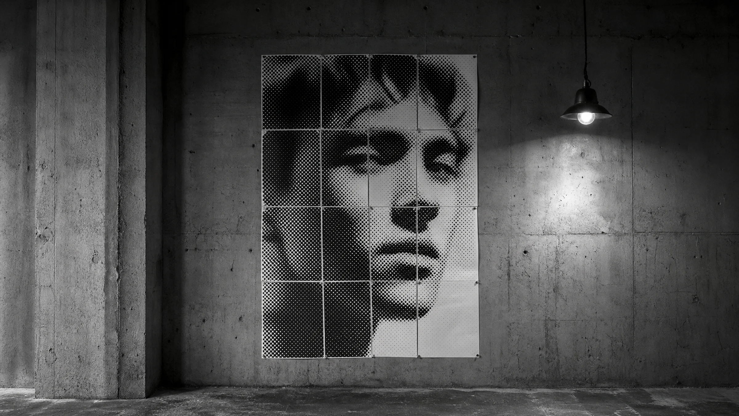
A black-and-white halftone poster is one of the easiest ways to turn a normal photo into oversized wall art. The effect is simple and striking: your image becomes a field of black dots on white paper, printed across several pages and assembled into one large poster.
There is one beginner detail to understand right away: most home printers leave a 3-5 mm unprintable white border on every sheet, and trimming is a normal required step if you want clean joins. Unless your printer supports true hardware borderless printing for that paper size, expect to trim.
This guide shows you how to choose a good source photo, set up the classic black-and-white halftone look in Rasterbator, preview dot size sensibly, and export a tiled PDF you can print at home.
What Rasterbator Does
Rasterbator turns one image into a multi-page poster. Instead of printing a single small photo, you generate a PDF split across regular printer pages such as A4 or Letter, then assemble those sheets into a larger image.
For the classic look, the image is rendered as halftone dots:
darker areas become larger dots
lighter areas become smaller dots
white areas may have little or no ink
From close up, the poster looks abstract and graphic. From a few steps back, the image reads clearly.
On Rasterbator.pics, images are processed locally in the browser. Your setup happens on your device while you work, and the result is exported as a predictable tiled PDF.
Why This Style Works So Well
A black-and-white halftone poster is especially good for:
portraits
silhouettes
bold objects
music or film-inspired wall art
dorm rooms, studios, and home offices
low-cost large prints from a normal desktop printer
It is less suitable for:
small text
subtle color photography
very detailed landscapes
polished photo prints with fine tonal transitions
The charm is in the graphic, handmade, oversized look.
Choose a Photo That Will Survive the Effect
Your source image matters more than any single setting. Halftone dots simplify detail, so start with a photo that already has a strong subject and clear contrast.
Look for:
one obvious subject
a simple or uncluttered background
clear light and dark areas
enough space to crop
features that still read when simplified
Avoid:
muddy low-contrast images
crowded group shots
tiny details that matter
screenshots with small text
blurry photos
important details right at the edge
For a first poster, a portrait with side lighting or a bright face against a darker background is usually the easiest win.
Decide Your Poster Size Before You Upload
A tiled poster is made from ordinary printer sheets. Decide early how big you want the finished piece to be so you do not build something far larger than you want to trim and assemble.
Common starting sizes:
| Poster layout | Approximate result | Good for |
|---|---|---|
| 2 x 2 sheets | Small test poster | Quick proof print |
| 3 x 3 sheets | Medium wall poster | Bedrooms, offices, studios |
| 4 x 4 sheets | Large poster | More dramatic wall art |
| 5 x 5 sheets or more | Very large poster | Events or big empty walls |
For a first attempt, 3 x 3 is the safest choice. It is large enough to feel like a real poster without turning into a long cutting session.
Step 1: Open Rasterbator and Upload Your Image
Go to Rasterbator and upload your photo.
A few practical tips:
use the original photo if possible
prefer a full-size JPG or PNG over a compressed social media copy
crop first if the subject is too small in the frame
keep the main subject away from the outer edge if you want easier assembly
After upload, check whether the subject fills enough of the poster area. If the person or object looks tiny in the preview, crop tighter before continuing.
Step 2: Set Paper Size and Poster Layout
Choose the same paper size your printer actually uses:
A4 in many countries
Letter in the United States and Canada
Then set the poster layout by number of sheets wide and high.
A reliable first setup is:
paper size: A4 or Letter
layout: 3 pages wide by 3 pages high
orientation: match the image, portrait or landscape
This is also the right moment to think about trimming.
Most consumer printers have a hardware-enforced 3-5 mm unprintable margin. Unless your printer supports borderless printing for that exact paper size, you will need to trim these edges to create a clean, seamless finish.
If you skip trimming, the assembled poster can show thin white gaps or a light grid between pages.
Step 3: Choose the Classic Black-and-White Halftone Look
For a traditional poster result, use a simple black-and-white dot setup:
color mode: black and white
background: white
dot color: black
dot shape: round
image style: halftone dots
This is the familiar look most people expect: black dots on white paper, scaled up across multiple sheets.
Why this setup is beginner-friendly:
it prints well on ordinary office printers
it usually uses less ink than full color
small alignment errors are less noticeable than in photo prints
the final result feels graphic rather than fussy
Step 4: Preview Dot Size Carefully
Dot size has the biggest effect on how your poster feels.
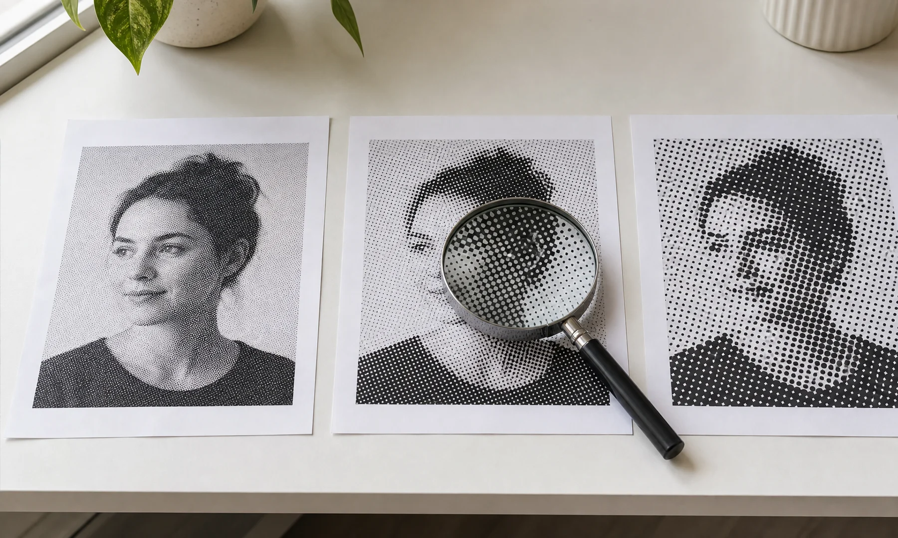
If the dots are too small:
the print can look muddy
the effect may feel weak
ink use may climb
the poster may resemble a rough photo print instead of a halftone
If the dots are too large:
faces can lose important features
the subject may become hard to read
the poster can feel too abstract for the chosen image
A useful starting point:
smaller poster, smaller dots
larger poster, slightly larger dots
portraits need enough detail around the eyes, nose, and mouth
silhouettes and bold shapes can handle bigger dots
Check the preview in two ways:
Look close up to see whether the dot pattern feels clean.
Step back from the screen and see whether the subject still reads.
Don't judge the poster from a single page. The effect makes more sense when you imagine the full grid assembled on the wall.
Step 5: Check Contrast Before Export
Halftone posters need strong light-to-dark separation. If the preview looks flat, the source image is usually the first thing to fix.
Helpful edits before upload:
increase contrast
brighten faces a little
darken weak shadows if the subject needs stronger shape
crop away empty background
convert the photo to black and white first if that helps you judge tones
Halftone dots rely on clear light-to-dark transitions. If the preview looks muddy, go back to your source image first and add contrast there. Rasterbator renders what you give it, so stronger contrast in the photo usually means cleaner dots.
For portraits, make sure eyes and mouth still read clearly in the preview. If they disappear, try a smaller dot size or a stronger source image.
Step 6: Export the Tiled Poster PDF
When the preview looks right, export the poster as a PDF.
A tiled PDF is the easiest format for most people because page size, order, and poster layout are already set. The file will usually save to your Downloads folder.
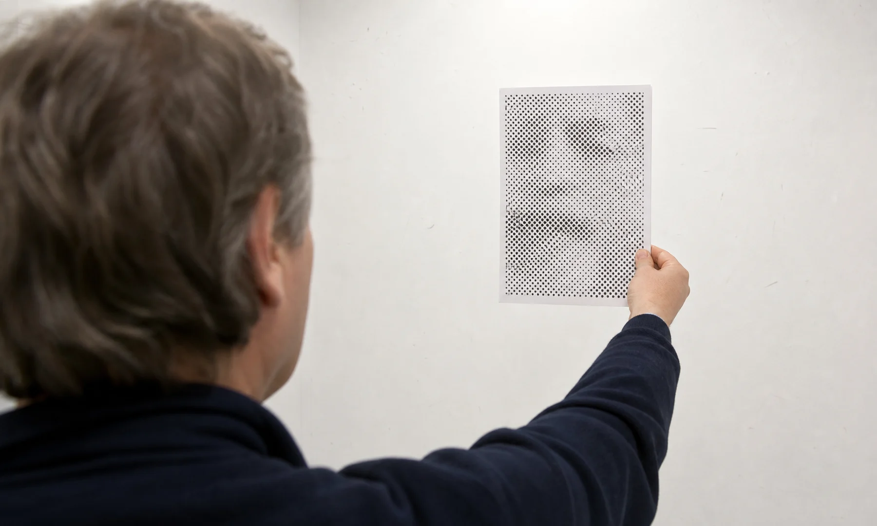
Before printing everything, open the PDF and check:
the paper size matches your real paper
the page count is what you expected
the crop looks right
the dots feel right at full page view
the page borders are manageable for your trimming plan
Checklist Before You Hit Print
Use this quick check before you send the full poster to the printer:
The photo has one clear subject.
The image has strong contrast.
The paper size in the PDF matches your printer paper: A4 or Letter.
The poster layout is manageable for your first build.
The preview is readable from a few steps back.
The dot size is not so small that the print will turn muddy.
You understand that your printer will likely leave a 3-5 mm white border.
You have decided whether to trim all margins, trim selected edges, or overlap sheets.
Your print dialog is set to Actual Size or 100%, not Fit to Page.
You have a glue stick or back-side tape ready for assembly.
Step 7: Print at Actual Size
When printing the PDF, set the scale to Actual Size or 100%.
Do not use:
Fit to page
Shrink oversized pages
Scale to printable area
Those options change page dimensions and can ruin alignment.
If you use Adobe Acrobat Reader, its Poster or tiled printing mode is useful when you need to split a normal PDF across pages. But if Rasterbator has already generated a tiled poster PDF, print that PDF at Actual Size. Do not tile it again in Acrobat.
Borderless printing is also worth clarifying: it is a printer hardware feature for specific paper sizes, not a magic software setting. If your printer does not truly support borderless output for that paper, plan to trim.
Step 8: Trim Before Assembly for the Cleanest Result
If you want the most professional-looking result, trim the printed borders before you lay out the full grid.
You have three practical approaches.
Option 1: Trim All Margins
Trim the white margins from every sheet and join the pages edge to edge.
This gives the cleanest finish, especially for portraits and high-contrast images where white seams would be obvious.
Useful tools:
metal ruler
craft knife
cutting mat
paper trimmer
Option 2: Trim Only the Overlap Edges
Trim only the edges that need to sit under or over neighboring sheets.
This is faster than trimming all four sides of every page and still gives a much cleaner result than leaving all margins in place.
Option 3: Overlap the Pages
Leave some margins in place and overlap sheets slightly.
This is the fastest approach, but it can produce a faint grid or thicker seams. It works best when speed matters more than a perfect finish.
Step 9: Assemble the Poster Cleanly
Lay out the pages on the floor or a large table before you start sticking anything down.
For assembly:
use a glue stick on overlapping flaps or trimmed joins
add tape only on the back side if you want extra strength
align rows first, then connect the rows together
Avoid glossy front-side tape on visible joins. Clear tape on the front catches light, creates glare, and makes seams much more obvious.
If the poster will hang for a while, consider mounting the finished piece to foam board, cardboard, or another backing surface.
Common Beginner Mistakes
Starting With a Weak Photo
A low-contrast image usually makes a weak halftone. Fix the photo first or choose a better one.
Going Too Large Too Fast
A 6 x 6 poster sounds fun until you realize it means 36 pages to print, trim, and align. Start smaller.
Using Dots That Are Too Fine
Tiny dots can look promising on screen and disappointing on paper. A slightly bolder dot pattern often prints better.
Printing With Scaling Turned On
If you use Fit to Page, the layout can drift and the joins can fail. Stick to Actual Size.
Expecting One Sheet to Look Finished
One page may look like random black marks. The image appears when the full poster is assembled.
Ignoring Printer Margins
If you do not plan for the white borders, you will either see white gaps or end up trimming in a rush after printing.
Practical Tips for a Better First Poster
Print a small test version first if you are unsure.
View the preview from farther back, not only up close.
Tight crops usually work better than loose ones.
Pencil the page order lightly on the back before trimming.
Assemble on the floor first, then mount.
Use a glue stick for clean paper joins.
Use tape on the back, not the front, if you need reinforcement.
FAQ
What kind of photo works best for a black-and-white halftone poster?
A photo with one strong subject, clear contrast, and a simple background. Portraits, silhouettes, and bold objects are usually the easiest.
Does Rasterbator.pics upload my image somewhere?
Rasterbator.pics processes images locally in the browser while you work.
What poster size should I choose for a first attempt?
A 3 x 3 sheet layout is a good starting point. It is large enough to feel impressive and still manageable to trim and assemble.
Why do my printed pages have white borders?
Most home printers cannot print to the edge of the page. They leave an unprintable margin of about 3-5 mm, so trimming is normal if you want clean joins.
Should I trim before or after I lay out the poster?
Trim first if you want the cleanest assembled result. That makes alignment easier to judge and avoids white gaps between pages.
What print scale should I use?
Use Actual Size or 100%. Do not use Fit to Page if Rasterbator already created the tiled PDF.
Can I use Adobe Acrobat Reader Poster printing instead?
Yes, for ordinary PDFs that need tiling. But if you exported a tiled PDF from Rasterbator, print that file at Actual Size instead of tiling it again in Acrobat.
What is the best way to join the pages?
A glue stick is usually the cleanest option. If you need reinforcement, add tape on the back side of the seams. Avoid front-side tape when visible joins or glare matter.
Is black and white better than color for a first project?
Usually yes. Black and white is simpler to dial in, easier on ink, and more forgiving during assembly.
Start With a Simple First Build
A strong first setup is straightforward: choose a high-contrast photo, use classic black round dots on a white background, preview the dot size carefully, export the tiled PDF, and print at Actual Size.
When you are ready, open Rasterbator and try a 3 x 3 poster with a portrait or another bold subject.
Try Rasterbator.pics
Use Rasterbator.pics to test the article advice with your own image, page size, overlap, margins, and tiled PDF export.
Try Rasterbator.pics