Classic black-and-white halftone and normal poster printing can both produce excellent wall art, but they are not trying to do the same job.
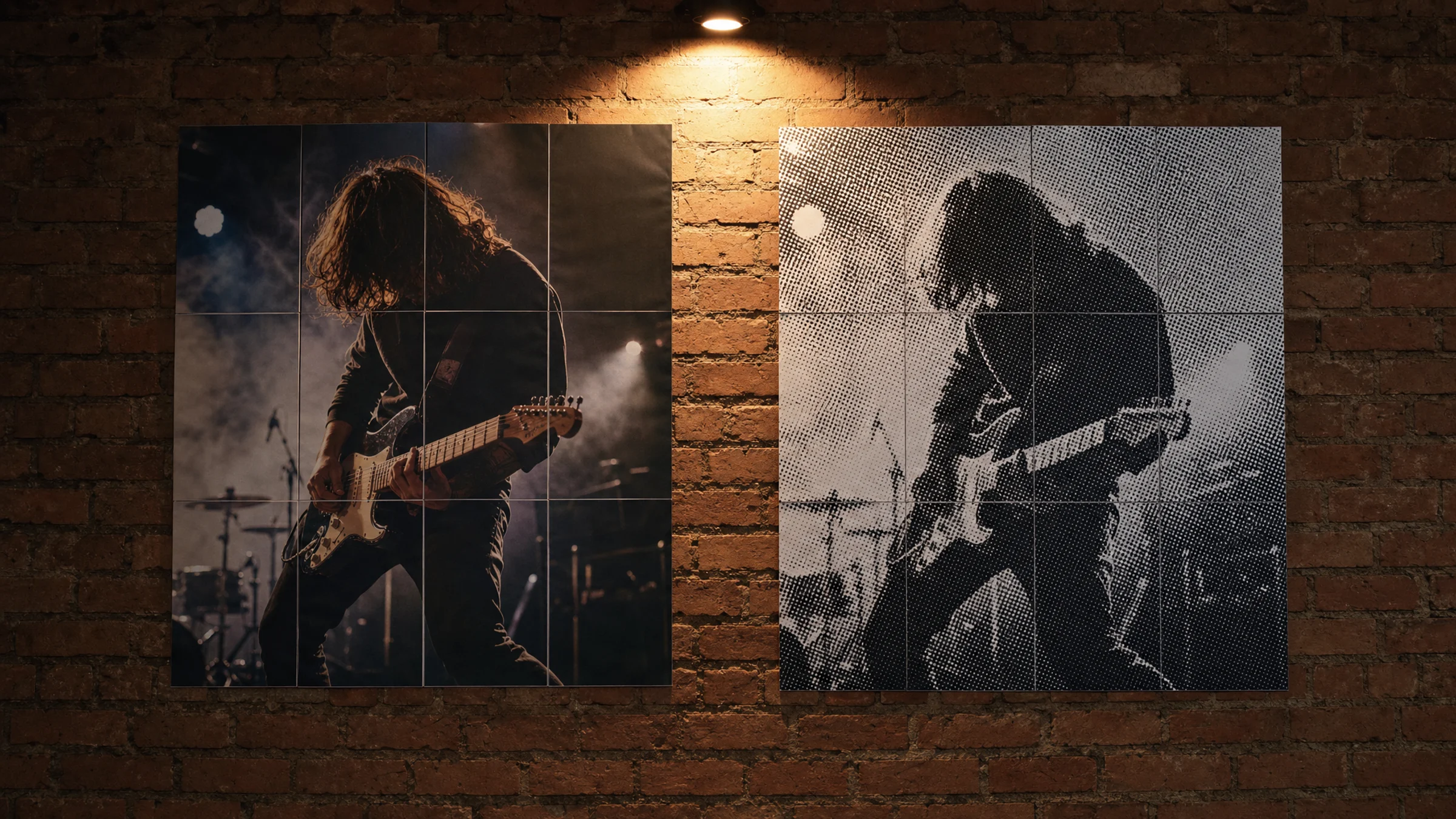
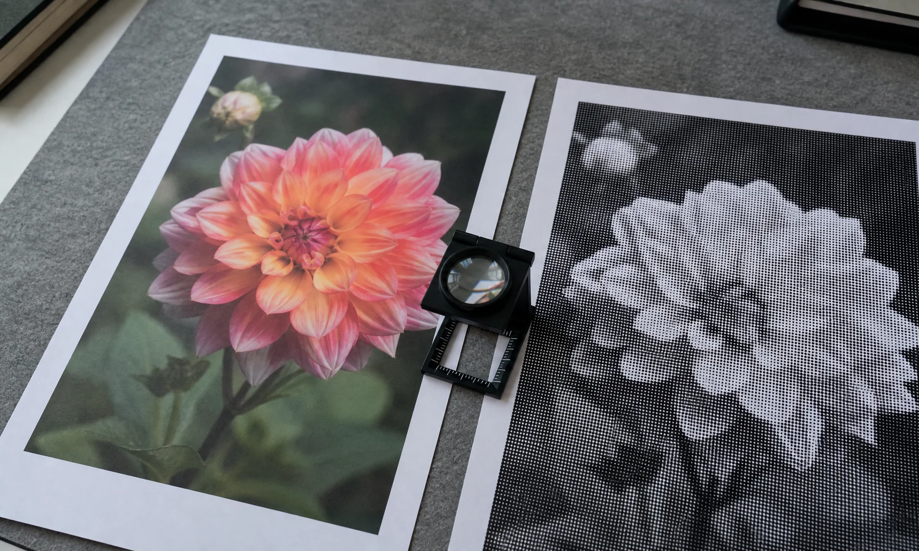
Normal poster printing tries to hide the print structure. It keeps photos smooth, preserves gradients, and makes the image feel close to the original. Classic halftone does the opposite: it turns tone into visible black dots. From close up, the poster looks like a pattern. From farther away, your eye rebuilds the image.
If you want to create that dot-based look, start with the halftone art poster generator. Rasterbator.pics processes the image locally in your browser, so the preview and PDF preparation happen on your device.
The quick choice
Use normal poster printing when the viewer should notice the content more than the print effect.
Use black-and-white halftone when the visible dot structure is part of the design.
| Need | Better choice | Why |
|---|---|---|
| Family photo or wedding portrait | Normal printing | Smooth skin tones and detail matter |
| Dramatic musician or actor portrait | Halftone | Strong light and shadow become graphic |
| Travel landscape with subtle color | Normal printing | Gradients and color are important |
| Street-style wall art | Halftone | Visible dots feel intentional |
| Text-heavy poster | Normal printing | Small text can break apart in dots |
| Low-resolution but bold image | Halftone | The dot pattern can stylize weak detail |
Halftone is not a repair tool for every bad photo. It can make a technically imperfect image more interesting, but it still needs a clear subject, strong contrast, and a readable silhouette.
What changes when an image becomes halftone
In a classic black-and-white halftone poster:
dark areas become larger black dots
light areas become small dots or empty paper
midtones become medium dots
small details may disappear
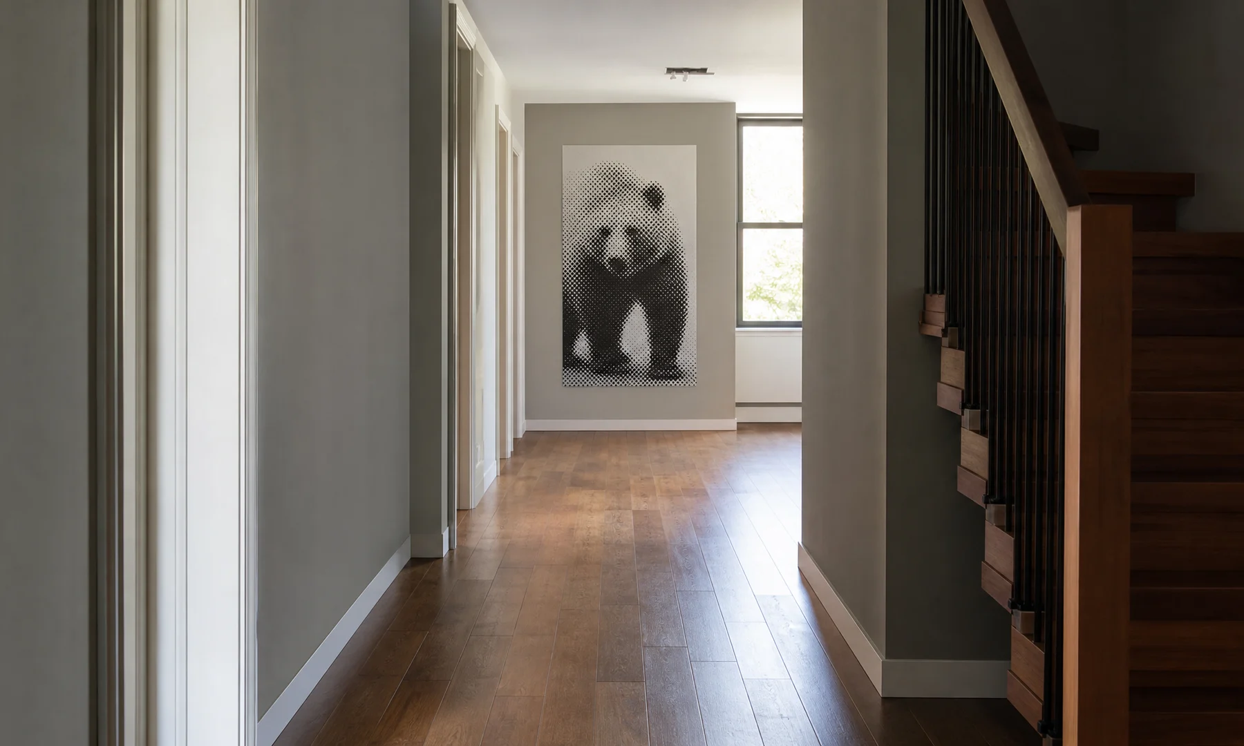
the image resolves better from a distance than from close up
That distance effect is the point. A halftone poster should not be judged only on a desk or phone screen. Tape a test sheet to the wall and step back to the distance where the finished poster will be seen.
Images that work well as halftone
Good halftone posters usually start with simple, high-impact images:
one clear face or object
strong contrast between subject and background
large light and dark areas
recognizable silhouette
limited clutter
eyes, hands, or one strong focal point
Avoid images where the subject blends into the background, the important detail is tiny, or the whole image is mid-gray. A color photo may also lose separation after conversion: red hair, green trees, and brown wood can all become similar gray values.
Before generating the poster, crop tighter and increase contrast if the image feels flat. You do not have to convert the file to grayscale first, but a quick black-and-white preview can help you judge whether the subject still reads.
Dot size and viewing distance
Dot size is the setting that changes the poster most.
| Viewing distance | Useful dot style | Best for |
|---|---|---|
| 30-60 cm / 1-2 ft | Small dots | Desk viewing and smaller posters |
| 1-2 m / 3-6 ft | Medium dots | Most wall portraits |
| 2-4 m / 6-13 ft | Large dots | Big tiled posters and hallway viewing |
| 4 m+ / 13 ft+ | Very large dots | Event and mural-like impact |
Small dots preserve more detail, but they may look like a normal grayscale print from far away. Large dots create the classic poster effect, but they can destroy facial features if pushed too far.
A practical test: squint at the preview or step back from your screen. If the subject disappears, reduce the dot size or choose a more contrasty crop.
Normal output vs halftone output
Normal printing is less forgiving of low image quality. A blurry photo usually becomes a blurry poster. It works best when the original file is sharp, high resolution, and well lit.
Halftone is more forgiving in some ways because the dots simplify the image. Small paper-feed differences and tiny tiled seams can also be less obvious inside a bold dot pattern. But halftone has its own failure modes: dots can become too small to feel intentional or too large to keep the subject readable.
Printing caveats for tiled posters
Most home and office printers cannot print to the exact edge of the sheet. They commonly leave an unprintable white border of about 3-5 mm. Unless your printer explicitly supports borderless printing for the paper you are using, expect to trim the sheets for a clean tiled poster.
For a cleaner result:
Print the exported PDF at Actual Size or 100%.
Turn off Fit to page and similar scaling options.
Print one test sheet before the full poster.
Let inkjet pages dry before stacking or gluing.
Trim one side of each overlap rather than cutting both sides.
Align the printed dots or image content, not just the paper edges.
Use a glue stick for visible joins.
Reinforce seams with tape on the back side.
Avoid glossy tape on the front if glare matters.
If important facial features land directly on page seams, adjust the crop or poster size before exporting.
FAQ
Is black-and-white halftone the same as grayscale printing?
No. Grayscale printing tries to make smooth tonal transitions. Black-and-white halftone creates tone with visible black dots on white paper.
What photos work best for halftone posters?
Strong portraits, silhouettes, and high-contrast subjects work best. Avoid cluttered backgrounds, tiny faces, and images where the subject depends on subtle color differences.
How do I choose the right dot size?
Choose dot size based on viewing distance. Smaller dots work for close viewing and detail. Larger dots work for big posters seen from across the room. Print a test sheet at Actual Size or 100% before printing the full poster.
Will a halftone poster look good on a home printer?
Often, yes. Black ink on ordinary white paper can work well for halftone wall art. Plan for the printer's unprintable margins and trim the tiled sheets carefully.
What is rasterbation?
Rasterbation is a common name for enlarging an image into a tiled poster, often with a visible dot or raster effect.
Final recommendation
Choose normal poster printing when accuracy, detail, and smooth tones matter. Choose classic black-and-white halftone when you want graphic impact, visible dot texture, and wall art that resolves from a distance.
The best test is simple: make two or three versions with different dot sizes, print one representative sheet at 100%, tape it to the wall, and look from the real viewing distance.
Try Rasterbator.pics
Use Rasterbator.pics to test the article advice with your own image, page size, overlap, margins, and tiled PDF export.
Try Rasterbator.pics