Yes, 100 DPI can be enough for a poster. For many wall posters, it looks perfectly acceptable from normal viewing distance.
But it is not a universal safe setting. At 100 DPI, a poster can also look soft if people will stand close to it, if it includes small text, or if the source image was already weak.
The short answer:
100 DPI is often fine for decorative posters viewed from a few feet away. It is usually not enough for close inspection, tiny text, or fine photographic detail.
If you want to check your own image before you start printing, use the DPI calculator to compare your image pixel size with the final poster size.
Before you get into numbers, one print reality matters right away: most home printers leave a 3–5 mm unprintable white border around each sheet. If you print a poster across multiple pages, trimming is a normal part of assembly if you want clean joins.
What 100 DPI means
DPI means dots per inch in print. In everyday poster planning, people often use it as shorthand for how many image pixels are available for each printed inch.
A 100 DPI poster uses about:
100 pixels per inch
1,000 pixels across 10 inches
2,000 pixels across 20 inches
3,000 pixels across 30 inches
For example, if your image is 3000 × 2000 pixels:
| Final print size | Approximate print resolution |
|---|---|
| 10 × 6.7 in | 300 DPI |
| 20 × 13.3 in | 150 DPI |
| 30 × 20 in | 100 DPI |
| 40 × 26.7 in | 75 DPI |
That is why the same file can look sharp at one size and disappointing at another. DPI is not fixed by the file alone. It depends on how large you print it.
For a quick check, use the DPI calculator to compare your image size with your final poster dimensions.
Is 100 DPI enough for a poster?
For many posters, yes.
100 DPI is often good enough for a wall poster when the poster is meant to be seen from across a room rather than examined from inches away.
It is usually acceptable for:
Decorative wall posters
Large photo collages
Event or classroom posters
Stylized halftone or raster dot posters
Large prints with bold shapes and simple composition
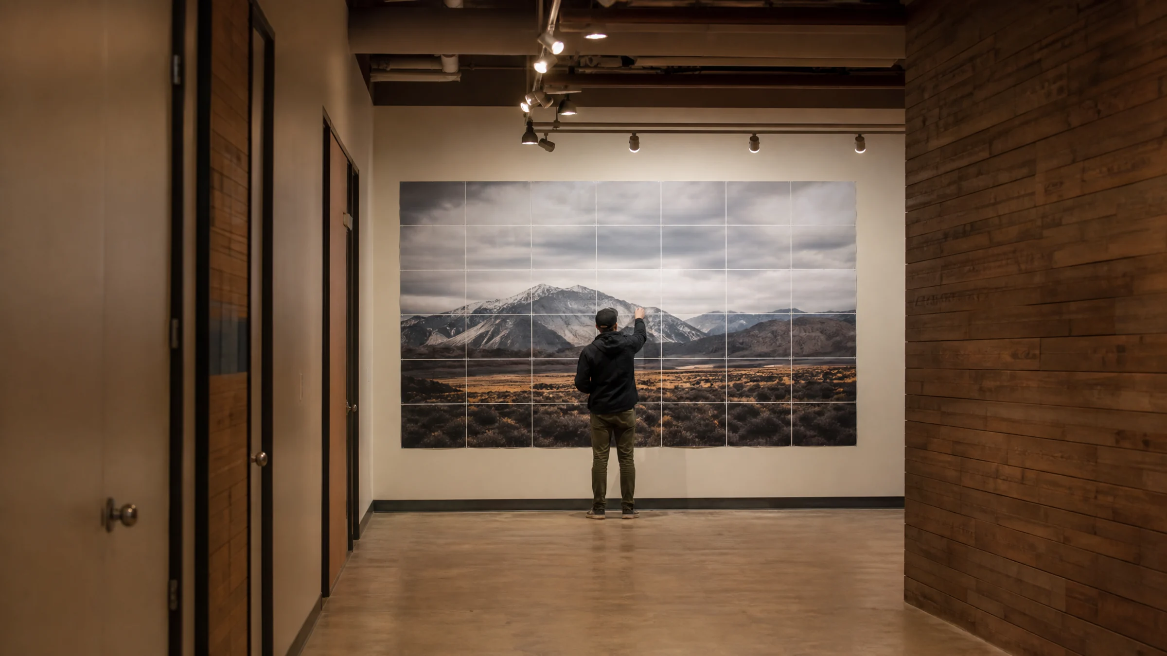
Tiled posters printed on A4 or Letter sheets and assembled for wall display
It is often not enough for:
Posters viewed from less than 2 feet
Small text, labels, maps, charts, or QR codes
Fine line art
Product or portfolio photography
Detailed architectural or technical images
Faces printed very large from a small source image
The key point is simple: 100 DPI can be enough for poster use without being “high-end photo print” quality.
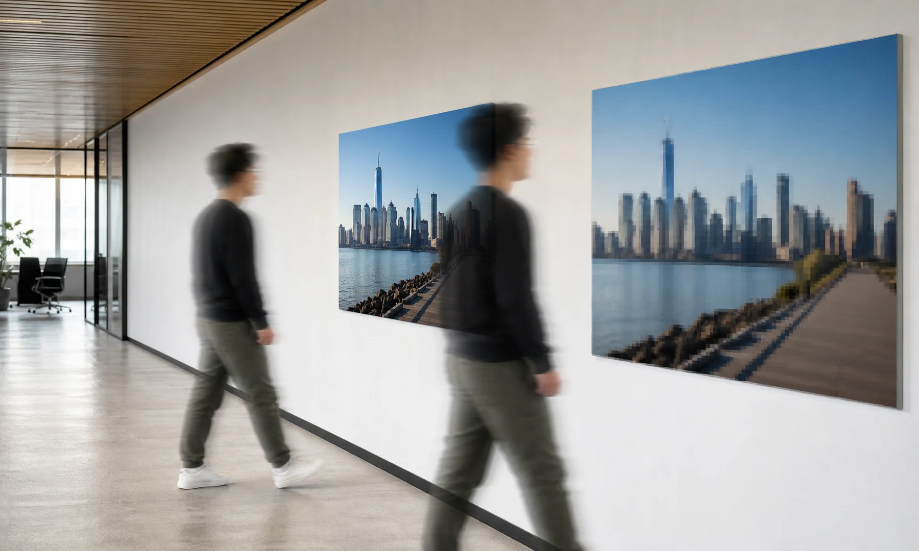
Viewing distance matters more than most people expect
A poster is not usually viewed like a postcard. People step back.
As viewing distance increases, your eyes stop resolving fine detail. That is why a billboard can look clear from across the street even though it looks rough up close.
Here is a useful guide:
| Viewing distance | Safer target resolution |
|---|---|
| Handheld or very close, under 1 ft / 30 cm | 250–300 DPI |
| Close wall viewing, 1–2 ft / 30–60 cm | 180–240 DPI |
| Normal poster viewing, 3–6 ft / 1–2 m | 100–150 DPI |
| Large display viewed from farther away | 50–100 DPI |
So if your poster will hang on a wall and people will mostly see it from a few feet away, 100 DPI is often fine.
If they will read it closely, study faces, or inspect texture, 100 DPI becomes much riskier.
How to calculate whether your image is large enough
Use this formula:
DPI = image pixels ÷ printed inches
You should calculate width and height separately. The lower result is the true limiting resolution.
Example:
Your image is 2400 × 3600 pixels and you want a 24 × 36 inch poster.
Width: 2400 ÷ 24 = 100 DPI
Height: 3600 ÷ 36 = 100 DPI
That is a true 100 DPI poster.
Another example:
Your image is 1600 × 2400 pixels and you want to print 24 × 36 inches.
Width: 1600 ÷ 24 = 67 DPI
Height: 2400 ÷ 36 = 67 DPI
That will usually look noticeably softer, especially at close range.
For a faster answer, enter your file dimensions and target size in the DPI calculator.
Common poster sizes at 100 DPI
These are the minimum image sizes that produce about 100 DPI:
| Poster size (inches) | Minimum image size for 100 DPI (pixels) |
|---|---|
| 12 × 18 in | 1200 × 1800 px |
| 16 × 20 in | 1600 × 2000 px |
| 18 × 24 in | 1800 × 2400 px |
| 20 × 30 in | 2000 × 3000 px |
| 24 × 36 in | 2400 × 3600 px |
| 30 × 40 in | 3000 × 4000 px |
| 36 × 48 in | 3600 × 4800 px |
These are planning numbers, not premium-quality targets.
If the poster needs to hold up better at close range, move up to 150 DPI, 200 DPI, or more.
When 100 DPI starts to look blurry
100 DPI becomes risky when one or more of these are true:
The poster includes small text
The original image is already soft
The file came from social media, a chat app, or a screenshot
You cropped a small area out of a larger photo
The poster will be viewed up close
The image contains hair, skin texture, leaves, fabric, or other fine detail
The file has been resized multiple times
The print dialog is set to Fit to page or another automatic scaling option
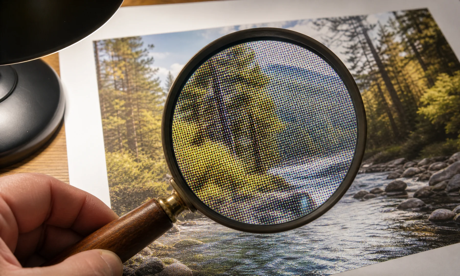
Quick test: zoom your image until one screen inch roughly matches one printed inch. If it already looks soft at that size, printing larger will not improve it.
Why halftone and raster effects can hide pixelation
Halftone and raster dot posters often use visible dot patterns. That style can make lower-resolution images more forgiving.
Instead of trying to preserve every tiny photographic detail, the image is translated into larger visual shapes and tones. From a normal viewing distance, your eye blends those marks together.
This can help hide:
Mild pixelation
JPEG artifacts
Slight blur
Uneven detail
Limited source resolution
That said, it is not magic. If the original file has missing facial detail, unreadable text, or heavy blur, no effect can truly restore that information.
What to do if your image is below 100 DPI
If your target size gives you less than 100 DPI, you still have a few practical options.
100 DPI and tile printing at home
If you print a large poster at home, you will usually split it across multiple A4 or Letter sheets. This is often called tile printing or poster printing.
Most consumer printers cannot print to the edge of the paper, leaving an unprintable white margin of about 3–5 mm. Unless your printer supports true borderless printing, you will need to trim these edges to create clean joins. Plan your assembly so you can either trim the white borders away or overlap sheets slightly where needed.
At home, print setup matters as much as DPI:
Print at Actual Size or 100% scale
Disable Fit to page or Scale to Fit
Check whether your PDF or image print dialog has applied any automatic resizing
Expect to trim white borders for neat alignment
Use a glue stick for smooth, flat mounting
Add tape on the back side across seams for strength and easier alignment
Avoid glossy front-side tape on visible joins, because it creates reflective seams and can curl
Adobe Acrobat Reader’s Poster printing mode works well if you already have a PDF and want to split it across sheets. For creative raster or halftone effects, or if you are starting from an image file, a browser-based tool like Rasterbator.pics is more direct.
Rasterbator.pics processes your image locally in your browser—your image never leaves your device.
A safer way to choose final poster size
If you are unsure, do not ask only, “Is 100 DPI enough?”
Ask these four questions instead:
How close will people stand?
Does the poster include small text or fine detail?
Is the source image genuinely sharp?
Would a slightly smaller final size still work?
A simple planning rule:
Use 150–200 DPI for posters that will be viewed quite close
Use 100–150 DPI for normal wall posters
Use 75–100 DPI only when the print is large, stylized, or viewed from farther away
Use 300 DPI mainly for small premium prints and close inspection
If your image only barely reaches 100 DPI and quality matters, choose a slightly smaller final size.
Checklist before you hit Print
Check the final resolution with the DPI calculator
View the image at an approximate print scale and inspect faces, text, and edges
Reduce the final poster size if the file already looks soft
Use Actual Size or 100% scale in the print dialog (avoid "Fit to page")
Verify that Scale to Fit or similar automatic scaling is disabled
Account for the 3–5 mm unprintable margins on each sheet
Decide whether you will trim borders or overlap sheets before mounting
Print one test sheet before committing to the full poster
Use a glue stick for consistent, flat mounting
Reinforce aligned seams with tape on the back side
Avoid glossy front-side tape on visible joins
FAQ
Is 100 DPI good quality for a poster?
100 DPI is often good enough for a wall poster viewed from a normal distance. It is not ideal for close inspection, small text, or fine photographic detail.
Is 100 DPI blurry?
Not automatically. A sharp image printed at 100 DPI can still look good from several feet away. It usually starts to feel soft when viewed up close or when the source file was already low quality.
What DPI should I use for poster printing?
For many posters, 100–150 DPI is a practical range. If the poster will be read closely, aim for 180–240 DPI if possible.
How many pixels do I need for a 24 × 36 inch poster at 100 DPI?
You need about 2400 × 3600 pixels.
Can I print a poster from a phone photo?
Yes, if the phone photo is sharp and large enough for your final print size. Many modern phone cameras can produce usable poster files, but screenshots, chat-app copies, and social media downloads often cannot.
Does tile printing reduce quality?
No, if you print at actual size and align sheets correctly. Quality loss usually comes from unwanted scaling, printer margins, poor alignment, or a low-resolution source.
Should I use Adobe Acrobat Reader for tiled poster printing?
Adobe Acrobat Reader’s Poster mode is useful when you already have a PDF and simply want to split it across sheets. If you are starting from an image and want clearer poster setup and predictable generated PDF output, Rasterbator.pics is often the simpler route.
Can halftone make a low-resolution image look better?
A halftone or raster dot effect can make low resolution less distracting and more intentional. It cannot recover detail that is missing, but it can suit a poster better than trying to force a weak image into a clean photo enlargement.
Bottom line
100 DPI is enough for many posters, especially decorative wall posters viewed from a few feet away.
It becomes risky when the poster will be inspected closely, includes small text, or comes from a weak source file. If you are near the limit, print smaller rather than stretching the image too far.
Check your pixel dimensions, compare them with your target size, account for viewing distance, and remember that tiled home printing usually means trimming margins before assembly. If you want to check your numbers quickly, use the DPI calculator before you print.
Try Rasterbator.pics
Use Rasterbator.pics to test the article advice with your own image, page size, overlap, margins, and tiled PDF export.
Try Rasterbator.pics