A classic black-and-white halftone poster can make an ordinary photo feel bold, graphic, and intentional. The look is simple: large monochrome dots, strong contrast, and a tiled print that reads as bold graphic art from across the room.
Before you choose a grid size, one practical note matters: most home printers leave a 3–5 mm unprintable white border on every side. That means trimming is a normal part of tiled poster assembly, not a mistake. If you want clean joins, plan for trimming from the start.
The style is not automatic, though. Some photos become striking halftone posters. Others turn into muddy dot noise once they are enlarged and split across pages.
The difference usually comes down to three choices:
The photo you start with
The poster grid size
The dot size and contrast settings
This guide will help you choose a photo that works, set a practical grid, and avoid compositions that become unreadable after tiling.
If you want a quicker starting point, browse a few ready-made options here: browse halftone presets.
When a classic black-and-white halftone works best
Use a classic black-and-white halftone when you want a high-impact poster without relying on color.
It works especially well for:
Portraits with a clear face shape
Musicians, actors, athletes, or personal hero shots
Pets with strong silhouettes
Objects with simple outlines, such as cameras, sneakers, bikes, or instruments
Street photos with strong light and shadow
Minimal poster designs where the dot texture is part of the appeal
It is less suitable for:
Group photos with many small faces
Busy backgrounds
Dark phone photos with heavy noise
Screenshots, memes, or tiny text
Photos where the subject is already very small in the frame
Halftone posters are viewed from a distance. If the subject is not clear as a thumbnail, it will not become clearer after conversion to dots.
What “classic black-and-white halftone” means
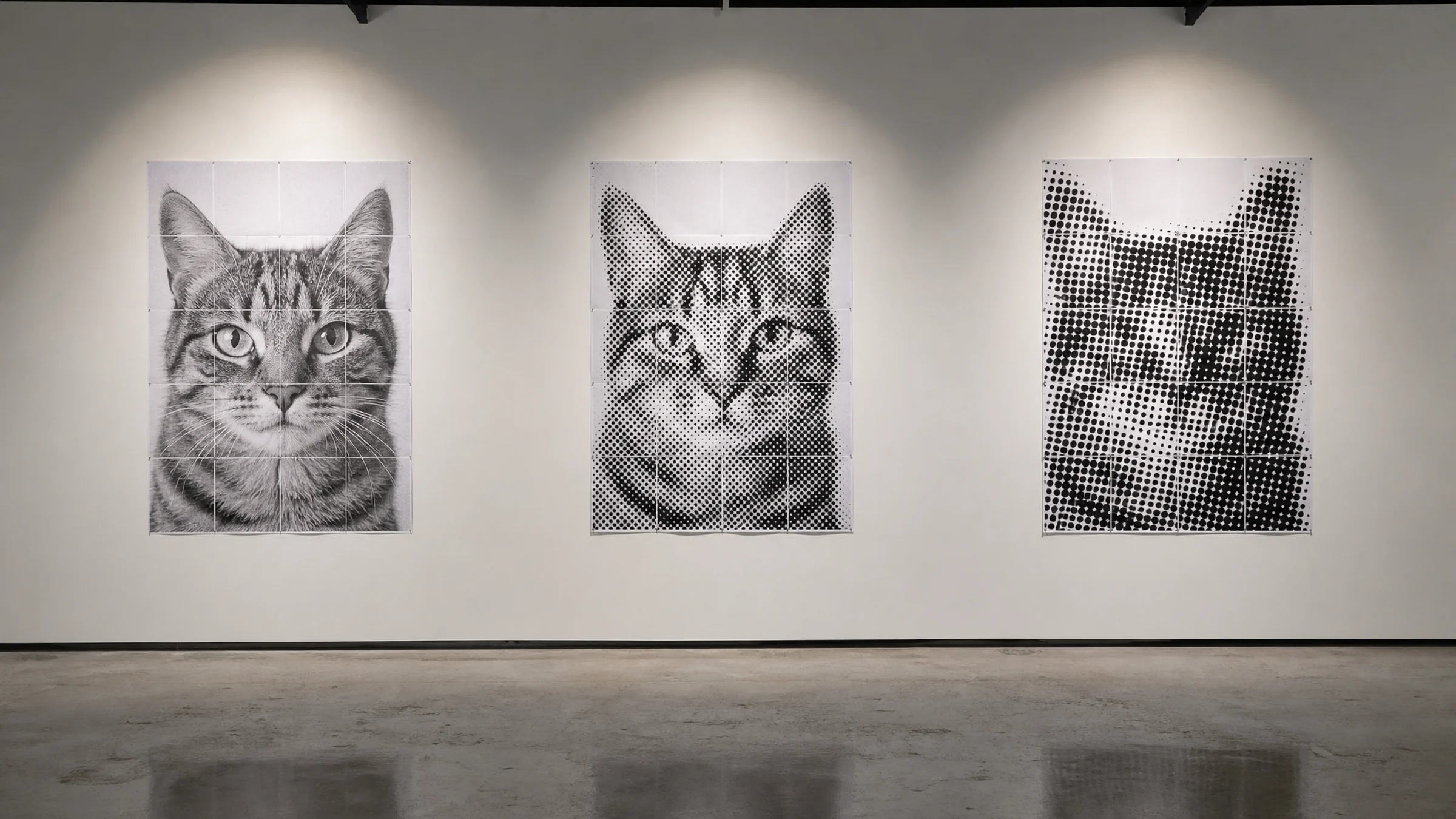
A classic black-and-white halftone poster uses dots to represent tone. Dark areas appear with larger or denser black dots. Light areas use smaller dots or more white paper.
The effect echoes old newspaper printing and photocopied gig posters.
For a clean, classic result, aim for settings like these:
| Setting | Recommended direction |
|---|---|
| Color mode | Black and white |
| Contrast | Medium-high to high |
| Dot style | Round dots |
| Dot scale | Visible from close up |
| Background | Plain or removed by cropping |
| Final size | Large enough for the dot pattern to feel intentional |
Start with the right photo
The photo matters more than the preset. A good halftone poster starts with a strong shape before any effect is added.
Choose one obvious subject
The safest choice is one main subject:
One face
One person
One pet
One object
One clear silhouette
Avoid photos where the main subject is not immediately obvious. Tiling introduces seams, and the dot pattern reduces fine detail. A weak composition usually gets weaker after printing.
Look for strong light and shadow
Halftone needs tonal separation. Good source photos usually have visible light direction:
A bright face against a darker background
A dark silhouette against a pale wall
Side lighting
Clear shadows
Distinct edges in hair, clothing, or objects
Flat lighting can still work, but you may need to increase contrast in the tool before printing.
Avoid tiny faces and tiny details
A face that occupies only a small part of the frame may disappear into dots. This matters even more in a tiled poster, because seams and trimming already compete for attention.
Be careful with images that depend on:
Small eyes in a full-body photo
Thin jewelry
Fine text on clothing
Distant buildings
Tree branches
Crowds
Small logos
For portraits, crop close enough that the head and shoulders occupy a meaningful part of the poster.
Use the thumbnail test
A fast way to judge a photo is to make it visually small.
Try this:
Open the photo on your phone or computer.
Zoom out until it looks small.
Squint slightly.
Ask yourself: “Can I still tell what this is?”
If the answer is yes, the image is a good candidate.
Crop before you decide on the grid
Cropping is part of the design, not a final adjustment. A stronger crop often matters more than a larger grid.
For portrait posters, these crops usually work well:
Face close-up for a dramatic result
Head and shoulders for a classic poster look
Half-body only if the pose is clear
Full-body only if the silhouette is strong and the poster will be large
Avoid leaving too much empty background unless it serves the composition. Empty space can look great, but on a tiled poster it also adds more paper, more trimming, and more visible seams.
Choose a grid size you will actually want to print
The grid size decides how many sheets your poster uses. A 3 × 4 poster uses 12 sheets. A 5 × 5 poster uses 25.
Because most printers leave 3–5 mm unprintable margins, more pages also mean more trimming and more chances for small alignment errors. That is why grid size is not just a visual choice. It is also a printing and assembly choice.
Quick grid recommendations
| Use case | Suggested grid | Notes |
|---|---|---|
| Small door or desk poster | 2 × 3 | Good for simple portraits and objects |
| Bedroom wall portrait | 3 × 3 or 3 × 4 | Reliable starting point |
| Large statement poster | 4 × 5 or 5 × 5 | Best for bold, simple compositions |
| Detailed image | Larger grid | Only if the subject still reads clearly |
| First poster | 3 × 3 | Easier to print, trim, and assemble |
For a first poster, use 3 × 3 or 3 × 4. These sizes are large enough for a wall poster but still manageable to print, trim, and assemble.
Do not scale up a weak image
A larger poster is not always better. Large grids can make weak photos look worse by exposing more paper seams, more dot texture, and more empty background.
Increase the grid size when:
The photo has one strong central subject
The poster will be viewed from several feet away
The wall has enough empty space
You are willing to trim and align many sheets carefully
Use a smaller grid when:
The image is busy
The subject is small in the frame
Wall space is limited
This is your first tiled poster
You want faster assembly
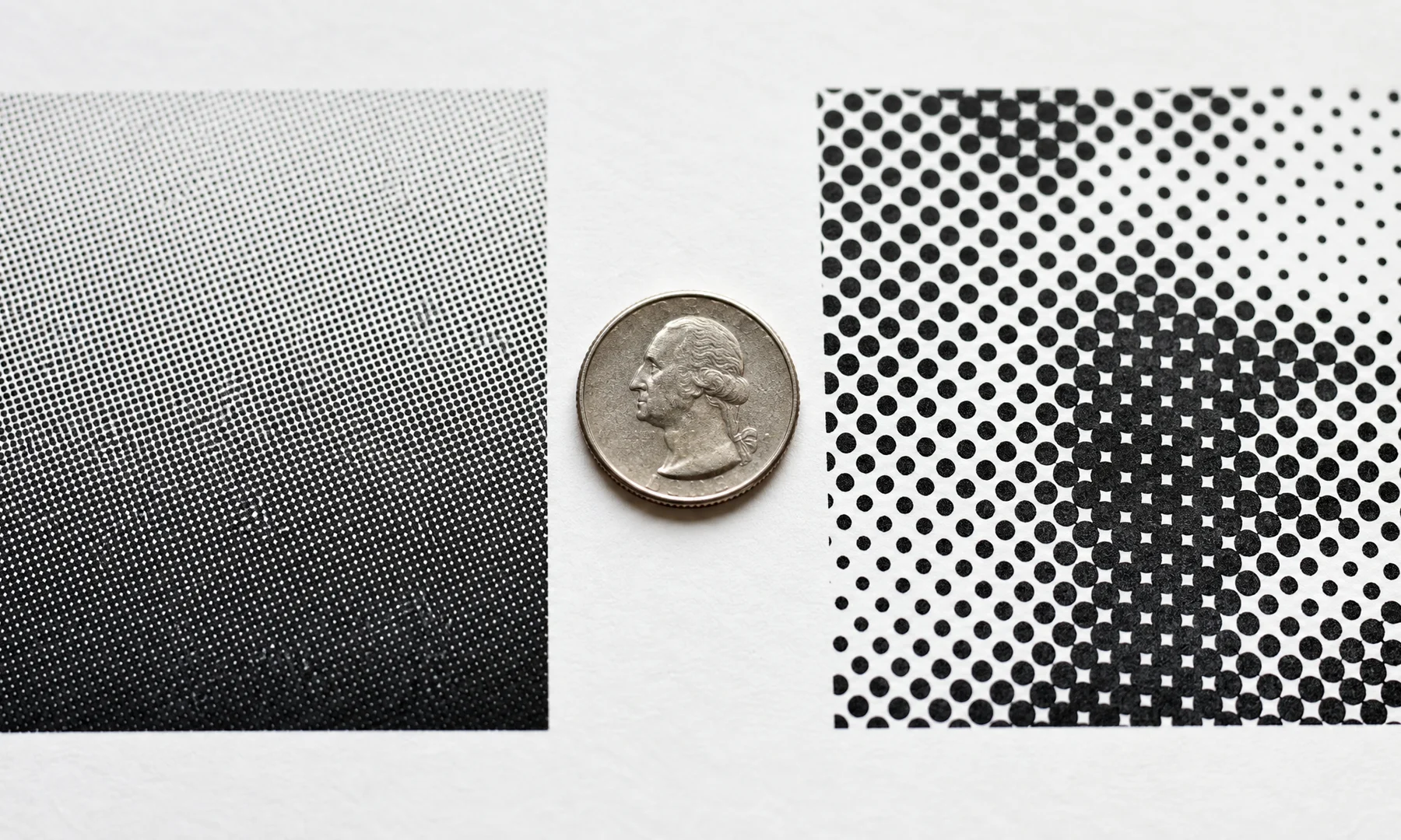
Set dot size for the look you want
Dot size controls how graphic the poster feels.
Large dots give you a bolder, more graphic halftone look. Smaller dots preserve more detail, but they can look less intentional if they become too fine.
Practical dot size guidance
| Dot size direction | Best for | Risk |
|---|---|---|
| Larger dots | Bold portraits, silhouettes, simple objects | Small details may disappear |
| Medium dots | Most photos | Less dramatic up close |
| Smaller dots | Detailed images, softer source photos | Can look weak or low-detail instead of intentionally graphic |
The dot pattern is the style, so embrace visible dots.
Match dot size to viewing distance
A poster seen from across a room can use larger dots. A poster meant for close viewing may need slightly smaller dots.
A simple rule:
Close viewing: medium dots
Normal wall viewing: medium to large dots
Big statement poster: large dots
If the eyes, mouth, or main subject outline disappear in the preview, reduce dot size or crop closer.
Use contrast to keep the subject readable
Black-and-white halftone depends on separation between light and dark areas. If the source image is flat and gray, the finished poster can look muddy.
Good contrast means the following:
The subject separates from the background
The face or object has clear light and dark areas
Important edges remain visible
White areas still exist
Dark areas do not all collapse into one shape
In Rasterbator.pics, use the contrast slider to separate light and dark areas until the subject outline is clear in the preview. For portraits, check the eyes, nose, mouth, hairline, and jaw. If these areas merge into one dark mass, reduce contrast or choose a different crop.
For objects, start by checking the outer silhouette. A strong outline matters more than fine internal detail.
Avoid compositions that fall apart after tiling
Tiling introduces seams, and every page has physical edges. Since home printers leave unprintable margins of 3–5 mm, trimming and alignment will affect the final result.
Watch for these problems:
Important facial features landing exactly on page seams
Very thin details crossing several pages
Tiny text split across tiles
A subject placed too close to the outer edge
Busy backgrounds competing with the subject
Low-contrast areas where the dots blur together
When possible, keep the most important part of the image away from page borders. For portraits, try not to place an eye or mouth exactly on a seam.
Preview the poster the way it will be seen
Do not judge the poster only from a zoomed-in screen view.
Before printing:
Zoom the preview out to around 50%.
Lean back or view it from arm’s length.
Check whether the subject is still recognizable.
Check whether the face, silhouette, or main object still reads clearly.
If the poster only works when viewed very close on screen, it probably needs a tighter crop, stronger contrast, a smaller grid, or slightly smaller dots.
Printing and assembly tips that save frustration
Most home printers cannot print to the edge, leaving a 3–5 mm unprintable margin on all sides. For a clean, seamless result, you will usually need to trim these white borders before joining the pages.
For the cleanest result:
Print at Actual Size or 100%
Avoid Fit to page
Trim with a metal ruler and sharp blade, or use a paper trimmer
Assemble the full poster on the floor or a large table before mounting it
Use a glue stick for clean joins with less wrinkling
If you want reinforcement, add tape on the back only after alignment
A glue stick is easier to control than liquid glue and creates less wrinkling. Front-side tape tends to catch light and make seams more obvious, so avoid it when glare or visible joins matter.
A simple workflow in Rasterbator.pics
Rasterbator.pics processes images locally in the browser, so no upload is required.
A practical workflow looks like this:
Pick a photo with one clear subject.
Crop it so the subject fills more of the frame.
Start with a black-and-white halftone preset.
Set a grid such as 3 × 3 or 3 × 4.
Adjust dot size until the image feels graphic but still readable.
Use the contrast slider until light and dark areas separate clearly.
Check that key features do not land on seams.
Export the PDF and print at Actual Size or 100%.
If you want to move faster, you can use a preset from the templates page.
What about Adobe Acrobat Reader Poster printing?
Adobe Acrobat Reader includes a Poster print mode to tile existing files. It is useful for printing, but it does not create halftone effects. Rasterbator.pics is clearer for halftone poster setup and gives you a predictable final PDF export; use Acrobat only if you already have a finished file and need to split it across pages.
If you choose Acrobat Reader’s Poster mode, verify these settings before printing:
Tile scale
Overlap
Paper size
Orientation
Printer scaling set to Actual Size or 100%
Always preview the page grid before printing.
Photo types that usually work well
| Photo type | Why it works | Suggested grid |
|---|---|---|
| Close-up portrait with side light | Strong facial structure and shadows | 3 × 3 or 3 × 4 |
| Dark dog on a light background | Clear silhouette | 3 × 3 |
| Singer at a microphone | Recognizable pose | 3 × 4 or 4 × 5 |
| Sneaker product photo | Simple object shape | 2 × 3 or 3 × 3 |
| Dramatic profile portrait | Strong outline | 3 × 4 |
| Full-body dancer silhouette | Movement reads from distance | 4 × 5 |
Photo types that often fail
| Photo type | Problem |
|---|---|
| Large group photo | Faces become too small |
| Dense forest or grass texture | Dots become visual noise |
| Dark blurry selfie | Halftone exaggerates blur and noise |
| Screenshot with small text | Text becomes unreadable |
| Busy street scene with no clear subject | The focal point is hard to find |
| Pale subject on pale background | Weak contrast after conversion |
Checklist before you hit Print
The main subject is clear at thumbnail size.
The crop makes the subject large enough.
The image has strong contrast or a strong silhouette.
The grid size fits both your wall and your patience for assembly.
Important details do not land directly on seams.
Dot size is visible without destroying the subject.
The preview still reads from arm’s length.
Paper size and orientation are correct.
Printer scaling is set to Actual Size or 100%.
You have allowed for 3–5 mm unprintable margins.
You are ready to trim for cleaner joins.
You have a ruler, blade or trimmer, glue stick, and back-side tape.
You have printed one test page or one test section first.
FAQ
What is the best photo for a classic black-and-white halftone poster?
The best photo has one clear subject, strong contrast, and a plain or simplified background. Close-up portraits, silhouettes, pets, and recognizable objects usually work better than group shots or busy scenes.
What grid size should I start with?
Start with 3 × 3 or 3 × 4. These sizes are large enough to feel like a real wall poster without creating too much trimming and assembly work.
Should I use large or small dots?
Use medium to large dots for the classic halftone look. If the subject becomes unreadable, reduce dot size or crop closer. If the image still looks too photographic, increase dot size.
Why does my halftone poster look messy?
The usual causes are a busy background, low contrast, too many small details, or a subject that is too small in the frame. Try a simpler photo, a tighter crop, or a smaller grid.
Can I print without trimming the pages?
Yes, but most printers leave 3–5 mm unprintable margins. If you do not trim, the final poster will show white grid lines. That can work if you want a handmade look, but trimming gives a cleaner result.
Should I print with “Fit to page”?
No. Use Actual Size or 100% so tiled pages align as expected. Fit to page can shrink sheets and complicate assembly.
Can I use Adobe Acrobat Reader for tiled printing?
Yes. Acrobat Reader’s Poster mode tiles a finished file across pages. It is useful for tiled printing, but it does not create the halftone style. Check tile scale, overlap, paper size, and printer scaling settings before printing.
Does Rasterbator.pics upload my image for processing?
No. Rasterbator.pics processes images locally in the browser.
Start with a preset
The fastest way to make a classic black-and-white halftone poster is to start with a preset, then adjust crop, grid, and dot size for your photo.
Open the template collection and choose a starting point here: start with a halftone preset.
zes and two dot sizes
Purpose: help readers see how readability changes
Caption: "A moderate grid with visible dots is often easier to print and easier to read than a much larger tiled version."
Try Rasterbator.pics
Use Rasterbator.pics to test the article advice with your own image, page size, overlap, margins, and tiled PDF export.
Try Rasterbator.pics