A classic black-and-white halftone poster is simple in materials but demanding in design. You are reducing a photo to one visual language: black dots on white paper. If the source image, dot size, and print settings work together, the result can feel bold, graphic, and intentional. If they do not, the poster can turn into an indistinct gray blur.
This guide explains how to make a classic B&W halftone poster with practical design choices and print-ready settings. You will learn how to choose a suitable photo, adjust contrast, compare dot sizes, avoid common composition mistakes, and export a tiled poster PDF for home or office printing.
You can create the poster in the Rasterbator.pics. Image processing happens locally in your browser, so your image does not need to be uploaded to a server for the halftone conversion.
Note on home printing: Most home and office printers leave a 3-5 mm unprintable white border around each sheet. Plan to trim margins and overlap pages during assembly. This is normal for clean tiled poster results, not a sign that something went wrong.
What makes classic black-and-white halftone work
A halftone image creates the illusion of tone using dots. Large dots read as dark areas. Small dots read as light areas. From a distance, your eye blends the dots into a recognizable image.
The classic black-and-white look depends on four things:
Strong value structure
The photo must have clear light, midtone, and dark areas.Readable subject shape
The silhouette and main facial or object features should stay recognizable after simplification.Appropriate dot size
Dots must be large enough to create a graphic poster look, but not so large that important details disappear.Correct viewing distance
A wall poster is usually seen from several feet or a few meters away. It does not need to look perfect up close.
A good halftone poster often looks almost abstract up close and sharp from across the room.
Choose the right photo
The photo matters more than any setting. Halftone does not magically fix a weak image. It exaggerates the strengths and weaknesses already present.
Good photo choices
Use photos with:
A clear main subject
Strong light direction
Visible shadows and highlights
Simple background
Sharp focus on the important area
Large facial features, hands, objects, or silhouettes
Enough resolution for the final poster size
Portraits, musicians, athletes, architecture, pets, vintage cars, and high-contrast still life images can all work well.
Risky photo choices
Avoid photos with:
Flat lighting
Busy backgrounds
Tiny faces in a crowd
Low contrast
Heavy blur
Important details in mid-gray only
White subject on white background
Dark subject on dark background
A halftone poster needs separation. If the original image already looks unclear as a small thumbnail, it will probably not become clearer as a dot poster.
Test the image as a thumbnail first
Before generating a large poster, shrink the photo visually in your mind or on screen. Ask:
Can I recognize the subject quickly?
Is the main shape obvious?
Are the eyes, face, logo, object, or silhouette readable?
Does the background compete with the subject?
If the answer is no, edit or crop the photo before making the halftone.
A useful rule: if the image works at small size, it usually works as a poster. If it only works when you zoom in, it may fail in halftone.
Crop for poster impact
Cropping is one of the fastest ways to improve a halftone design.
For portraits:
Crop closer than you normally would.
Keep eyes, mouth, hairline, and shadow shapes large enough.
Avoid placing the face too small in the frame.
Leave some negative space if you want a more editorial poster style.
For objects:
Make the object large and dominant.
Avoid thin outlines if they are essential to recognition.
Use diagonal placement if the image feels static.
Remove distracting background areas when possible.
For architecture:
Emphasize strong geometry.
Use shadows, windows, and repeated shapes.
Avoid scenes where every line has the same visual weight.
Adjust contrast before halftone
Black-and-white halftone needs contrast. A flat photo often produces a weak poster with too many medium-sized dots.
Before exporting, aim for:
Deeper shadows
Clear highlights
Controlled midtones
Distinct separation between subject and background
You do not need to destroy all detail, but the poster should have a strong black-white rhythm.
A practical approach:
If possible, edit your photo in black and white before using the tool, or at least preview it in grayscale.
Increase contrast until the subject becomes clear.
Brighten or darken the background if it competes.
Preserve key features such as eyes, mouth, hands, or object edges.
Avoid making the whole image equally dark.
Adjust contrast in your photo editor before uploading, or use Rasterbator.pics' built-in contrast controls during the halftone preview stage.
In Rasterbator.pics, compare a few halftone previews rather than trusting the first result. Small changes in contrast can make a large difference in dot readability.
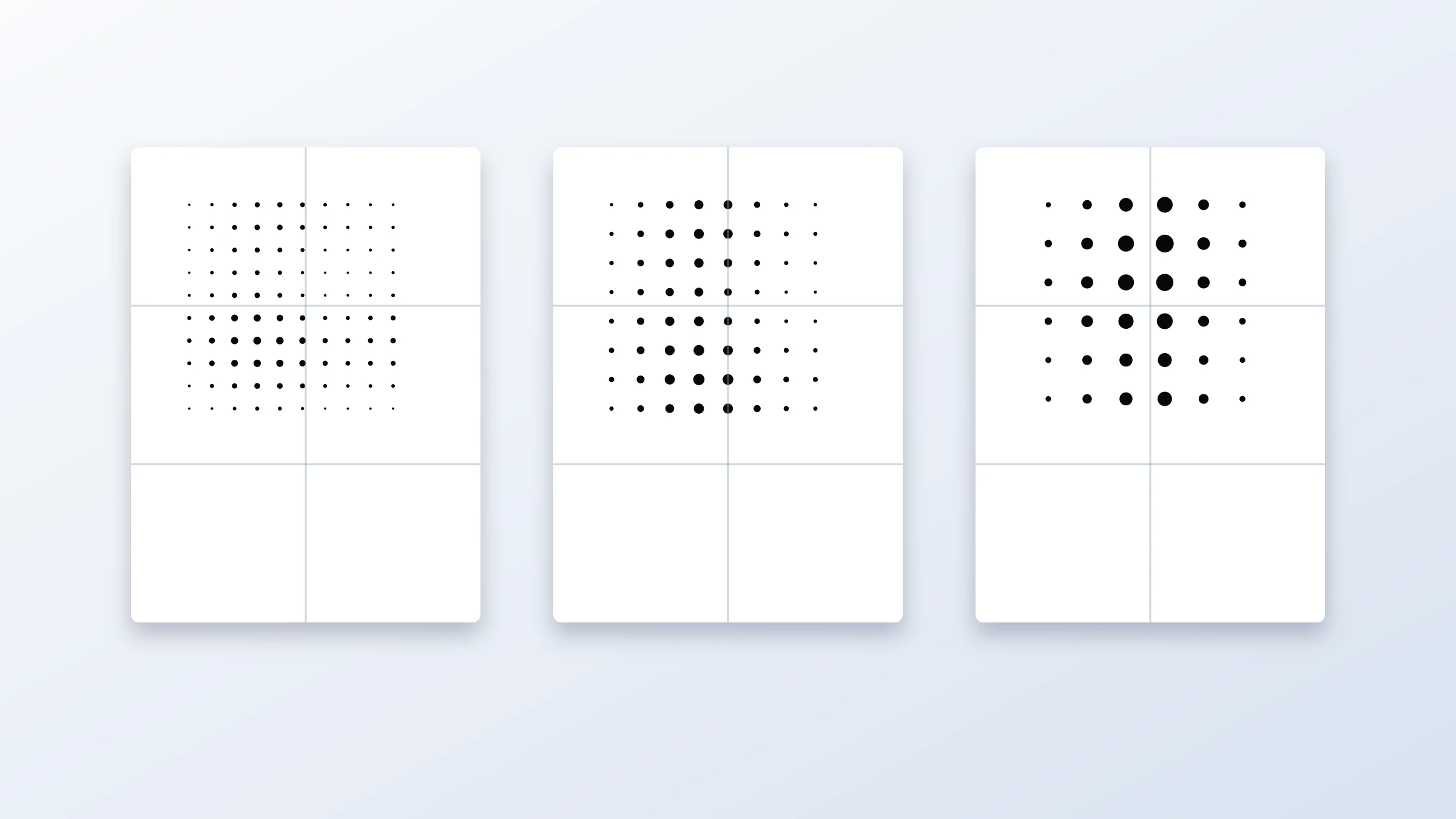
Pick the right dot size
Dot size controls the character of the poster. This is the setting most worth comparing.
| Dot size style | Visual effect | Best for | Risk |
|---|---|---|---|
| Small dots | More detail, smoother tones | Faces, photos with subtle features, smaller posters | Can look like ordinary printed grayscale from a distance |
| Medium dots | Balanced classic halftone look | Most wall art posters | May lose small details |
| Large dots | Bold graphic pop-art effect | Big posters, strong silhouettes, simple images | Can make faces or text unreadable |
For a classic black-and-white halftone poster, medium dots are often the safest starting point.
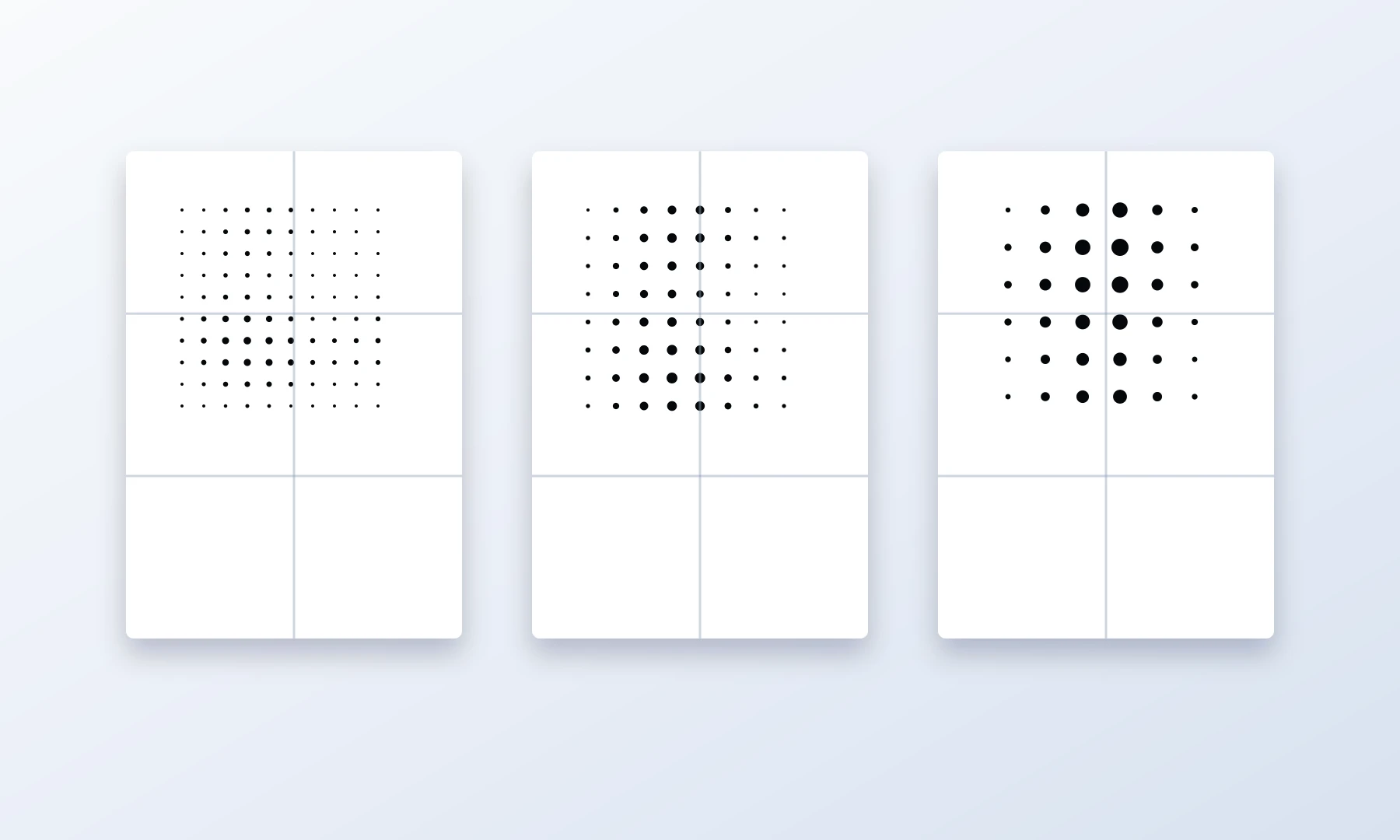
How to compare dot sizes
Make three quick versions:
Small-dot version for detail
Medium-dot version for balance
Large-dot version for graphic impact
Then view each one zoomed out on screen. Do not judge only at 100% screen zoom. A tiled poster is meant to be seen from a wall-viewing distance.
Choose the version where:
The subject is recognizable from far away
The dots are visible enough to feel intentional
Important features do not break apart
The dark areas still have shape, not just solid black blocks
Use black and white deliberately
Classic B&W halftone is not just "no color." It is a design decision.
The strongest versions usually have:
Pure black dots
White or near-white paper background
A limited tonal range
Clear dark shapes
No unnecessary visual noise
If you want a vintage newspaper feeling, black dots on warm off-white paper can look good. If you want a cleaner gallery look, use white paper and crisp black dots.
Avoid low-contrast gray dots unless you intentionally want a soft look. Gray can reduce the bold halftone effect and may print unpredictably on different printers.
Avoid common halftone composition mistakes
Mistake 1: The face is too small
A face that looks fine in a normal photo may become unreadable in halftone. Eyes and mouth can dissolve into dots.
Fix: crop closer or use smaller dots.
Mistake 2: The background is too busy
Halftone turns background texture into visual noise. Leaves, crowds, patterned walls, and cluttered rooms can compete with the subject.
Fix: crop, blur, brighten, darken, or remove the background before making the halftone.
Mistake 3: Everything is midtone
If the whole image has similar brightness, the poster will be full of similar dot sizes. It may look dull.
Fix: increase contrast and create stronger highlights and shadows.
Mistake 4: Dots are too large for the subject
Large dots look stylish, but they can erase identity in portraits or small objects.
Fix: compare medium and small dot versions before committing.
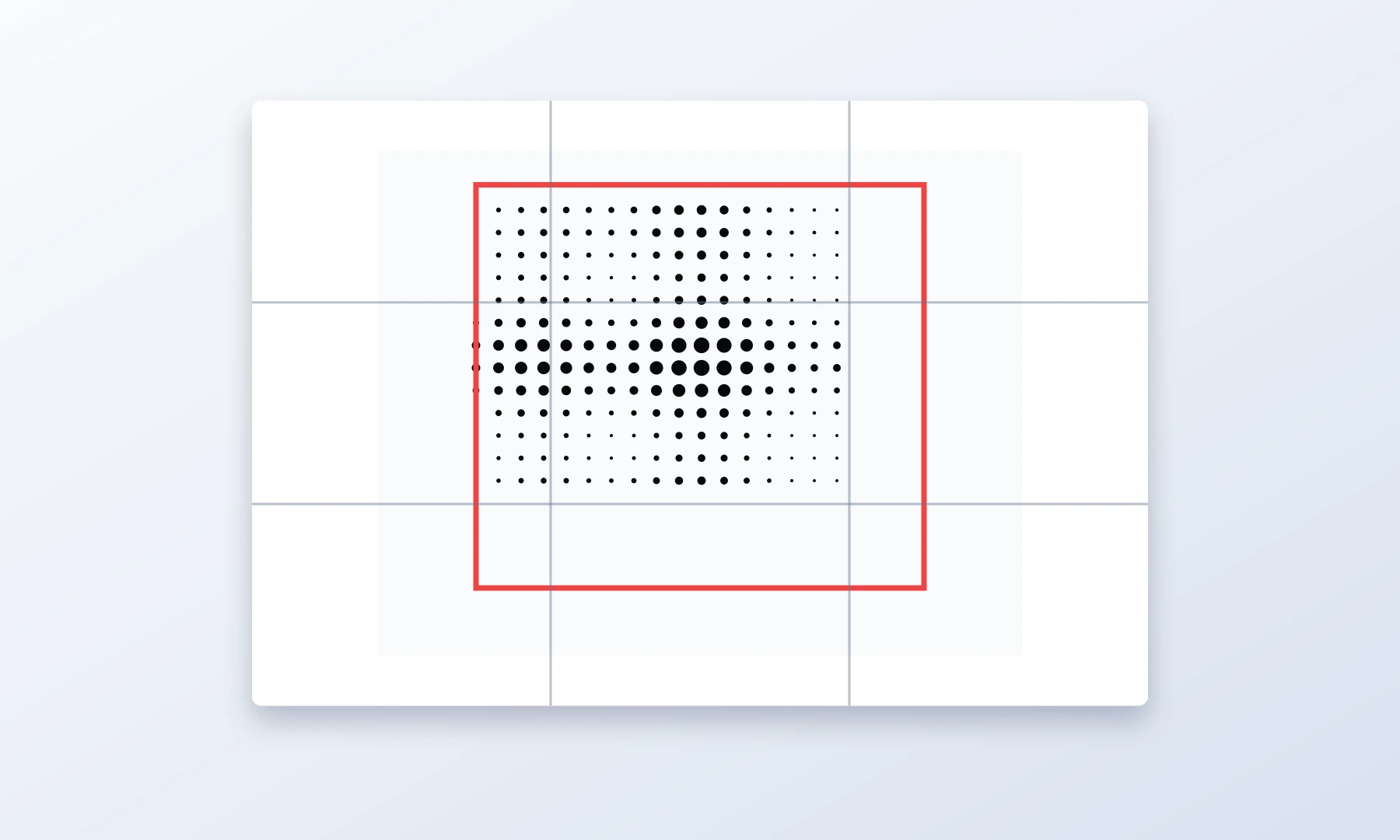
Mistake 5: Important detail falls across page seams
In a tiled poster, the image is split across multiple sheets. If an eye, mouth, logo, or important edge lands exactly on a seam, trimming and alignment become more noticeable.
Fix: adjust crop, poster size, or tiling layout if possible.
Recommended design workflow
Use this workflow when making a classic black-and-white halftone poster:
Choose a high-contrast image with a clear subject.
Crop for a strong silhouette or face composition.
Increase contrast before generating the halftone.
Open the image in the Rasterbator.pics.
Select the Halftone style and set the color mode to Black & White.
Generate a preview.
Compare small, medium, and large dot sizes.
Check the image from a distance on screen.
In the Export step, confirm your page layout, paper size such as A4 or Letter, orientation, and intended wall dimensions.
Generate the tiled poster PDF.
Print one test page before printing the full poster.
This "compare dot sizes" step is especially important. A halftone poster can change from subtle to iconic with one dot-size adjustment.
Example PDF setup
Here is a practical example for a home-printed wall poster:
| Setting | Example choice |
|---|---|
| Image type | High-contrast portrait |
| Poster size | 3 pages wide by 4 pages tall |
| Paper | A4 or Letter |
| Color | Black dots on white background |
| Dot style | Medium classic round dots |
| Print scale | Actual Size or 100% |
| Assembly | Trim margins, glue stick, back-side tape |
This produces a manageable tiled poster PDF with enough size for visible dots while still being realistic to assemble at home.
If you are unsure, start with a smaller layout such as 2 by 3 pages. It is better to complete a clean smaller poster than abandon a huge one halfway through assembly.
Print settings that matter
A halftone poster can be designed well and still fail at the printing stage. Check these settings carefully.
Use Actual Size or 100%
When printing the exported PDF, choose Actual Size, 100%, or equivalent. Avoid Fit to page if it changes the scale. Scaling can shift tiles, alter overlap behavior, and make assembly less accurate.
Expect unprintable margins
Most home printers have a hardware limit that prevents printing to the very edge of the page, typically leaving a 3-5 mm white border. Because of this, you should expect to trim the edges of your printed sheets to achieve a seamless join.
When assembling, align your sheets by overlapping the unprinted margins rather than relying on a perfect edge-to-edge feed from your printer.
Borderless printing can help on some printers, but it is not always available and may slightly enlarge or crop the image.
Print a test page
Before printing all sheets, print one page that includes important dark and light areas. Check:
Are the dots crisp?
Are dark areas too heavy?
Are light areas visible?
Is the scale correct?
Does the printer create unwanted banding?
If the test page is too dark, reduce contrast slightly or choose a smaller dot size. If it is too pale, increase contrast or use deeper black output.
Acrobat Reader Poster printing: useful but not always necessary
Adobe Acrobat Reader includes a Poster printing mode that can tile a large PDF across multiple pages. This is useful if you have a single large-page PDF and need Acrobat to split it into sheets.
However, if Rasterbator.pics already exports your design as a tiled PDF, you may not need Acrobat's Poster mode. In that case, print the PDF at Actual Size or 100% and avoid double-tiling.
Use Acrobat Reader Poster mode when:
Your PDF is one large page
You need Acrobat to create the tiles
You want to control overlap inside the print dialog
Avoid it when:
Your exported PDF is already tiled into pages
Poster mode would rescale or retile the design unexpectedly
You are not sure whether Acrobat is adding extra scaling
The key is simple: tile once, not twice.
Assembly tips for a clean poster
After printing, let the ink dry before handling the pages heavily. This is especially important for inkjet prints with dense black dots.
For assembly:
Lay out all pages on the floor or a large table.
Confirm the full image before trimming.
Trim only the edges that need to overlap.
Use a glue stick for broad, flat adhesion.
Use small pieces of tape on the back side to reinforce seams.
Avoid glossy tape on the front. It creates visible lines across the image, especially under room lights.
Work from the center outward when aligning large posters.
Keep hands clean to avoid smudging black ink.
A glue stick gives a flatter front surface than thick liquid glue. Back-side tape helps hold seams without making the front look patched.
For the cleanest seams, overlap the white margins of adjacent sheets. Use a sharp hobby knife and a metal ruler to cut through both layers at once along the seam. Remove the excess paper strips; this creates a closely matched joint. Always cut on a safe cutting mat or protected surface.
Checklist before you hit Print
The subject is clear from a distance.
The crop is strong and not too loose.
The background does not compete with the subject.
Contrast is high enough for black-and-white halftone.
You compared at least two or three dot sizes.
Important details do not fall awkwardly on page seams.
The page layout matches your intended wall size.
Paper size and orientation are correct.
The PDF is exported at the intended poster size.
Printer scaling is set to Actual Size or 100%.
You have allowed for 3-5 mm unprintable margins.
You are ready to trim, align, glue, and reinforce with back-side tape.
You printed a test page before committing to the full poster.
Creative examples to try
High-contrast portrait
Use a close portrait with side lighting. Medium dots usually work best. Keep the eyes large enough to remain readable.
Music poster style
Use a singer, guitarist, DJ, or band photo with a dark background and strong highlights. Large dots can work if the silhouette is clear.
Architectural wall art
Use a building facade, staircase, bridge, or window grid. Medium or large dots can create a strong graphic pattern.
Pet poster
Use a close-up pet portrait with bright eyes and a simple background. Small or medium dots usually preserve expression better than large dots.
Minimal object poster
Use one object, such as a camera, sneaker, chair, plant, or bicycle. Large dots can work well if the object has a bold outline.
FAQ
How do I make a classic black-and-white halftone poster?
Start with a high-contrast photo, crop it tightly, choose a black-and-white halftone style, compare dot sizes, and export a tiled poster PDF. You can do this in the Rasterbator.pics, where image processing happens locally in your browser.
What dot size should I use?
Medium dots are the best starting point for most classic halftone posters. Use smaller dots when you need facial detail. Use larger dots when the image has a strong silhouette and you want a bold graphic effect.
Why does my halftone poster look muddy?
The most common reasons are low contrast, a busy background, too many midtones, or dots that are too small to feel intentional. Increase contrast, simplify the crop, and compare a larger dot size.
Can I print a halftone poster on a normal printer?
Yes. A home or office printer can work well for tiled halftone posters. Print at Actual Size or 100%, allow for 3-5 mm unprintable margins, trim the necessary edges, and assemble with a glue stick or tape on the back side.
Should I use Adobe Acrobat Reader Poster mode?
Use Acrobat Reader Poster mode if you have a single large-page PDF and need Acrobat to tile it. If your exported PDF is already tiled, avoid double-tiling and print at Actual Size or 100%.
How do I assemble a tiled halftone poster?
Print all pages, let the ink dry, trim the necessary margins, align the sheets carefully, and use a glue stick for the overlaps. Reinforce seams with tape on the back side, not glossy tape on the front.
What kind of photo works best?
Choose a clear subject with strong light and shadow. Close portraits, musicians, architecture, pets, and simple objects often work well. Avoid flat lighting, tiny subjects, and cluttered backgrounds.
Try Rasterbator.pics
Use Rasterbator.pics to test the article advice with your own image, page size, overlap, margins, and tiled PDF export.
Try Rasterbator.pics